Data visualisation
Contents
Data visualisation
Although argopy is not focus on visualisation, it provides a few functions to get you started. Plotting functions are available for both the data and index fetchers.
Trajectories
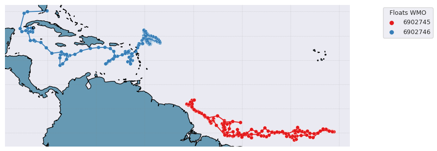
from argopy import IndexFetcher as ArgoIndexFetcher
idx = ArgoIndexFetcher().float([6902745, 6902746]).load()
fig, ax = idx.plot('trajectory')
fig, ax = idx.plot()  # Trajectory is the default plot
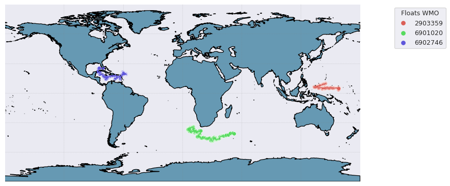
Some options are available to customise the plot, for instance:
from argopy import DataFetcher as ArgoDataFetcher
idx = ArgoDataFetcher().float([6901020, 6902746, 2903359]).load()
fig, ax = idx.plot('trajectory', style='white', palette='hls', figsize=(10,6), set_global=True)
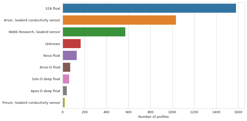
Histograms on properties
It is also possible to create bar plot for histograms on some data properties: ‘profiler’ and ‘dac’:
from argopy import IndexFetcher as ArgoIndexFetcher
idx = ArgoIndexFetcher().region([-80,-30,20,50,'2021-01','2021-08']).load()
fig, ax = idx.plot('dac')
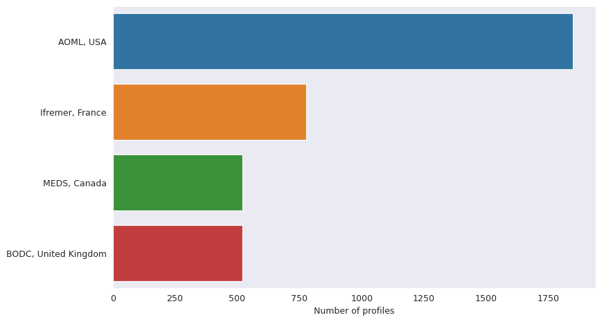
fig, ax = idx.plot('profiler')
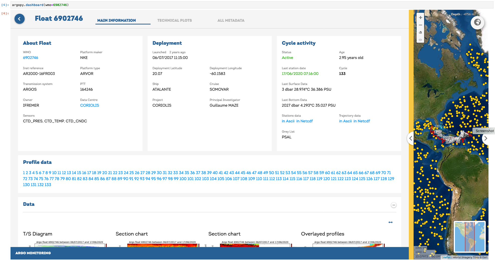
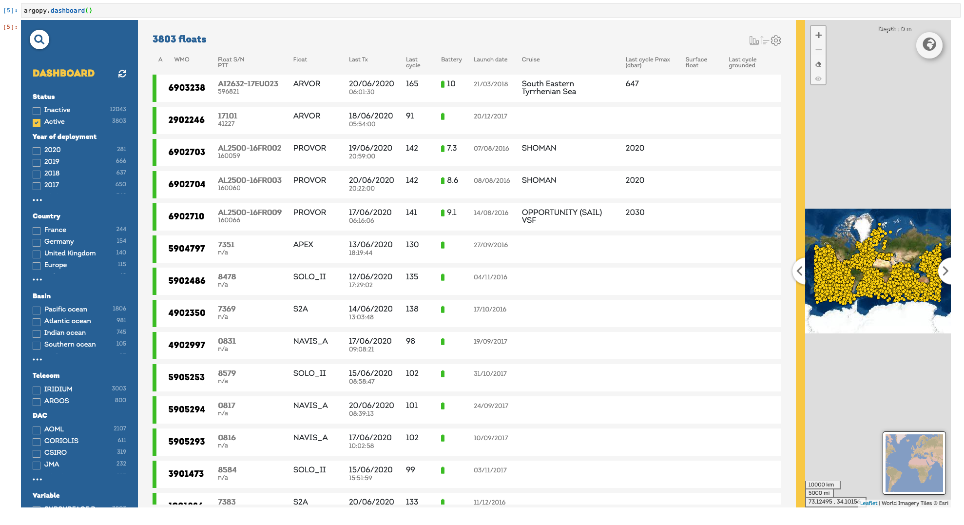
Float dashboard
When working in Jupyter notebook, you can insert the EuroArgo dashboard in a cell with:
import argopy
argopy.dashboard()
and for a specific float, just provide its WMO:
import argopy
argopy.dashboard(wmo=6902746)