Data visualisation
Contents
Data visualisation#
Although argopy is not focus on visualisation, it provides a few functions to get you started. Plotting functions are available for both the data and index fetchers.
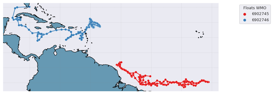
Trajectories#
from argopy import IndexFetcher as ArgoIndexFetcher
idx = ArgoIndexFetcher().float([6902745, 6902746]).load()
fig, ax = idx.plot('trajectory')
fig, ax = idx.plot()  # Trajectory is the default plot
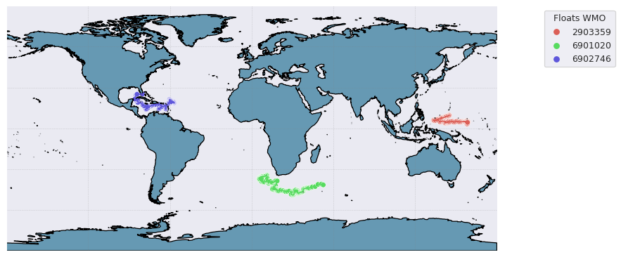
Some options are available to customise the plot, for instance:
from argopy import DataFetcher as ArgoDataFetcher
idx = ArgoDataFetcher().float([6901020, 6902746, 2903359]).load()
fig, ax = idx.plot('trajectory', style='white', palette='hls', figsize=(10,6), set_global=True)
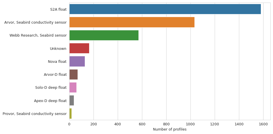
Histograms on properties#
It is also possible to create bar plot for histograms on some data properties: ‘profiler’ and ‘dac’:
from argopy import IndexFetcher as ArgoIndexFetcher
idx = ArgoIndexFetcher().region([-80,-30,20,50,'2021-01','2021-08']).load()
fig, ax = idx.plot('dac')
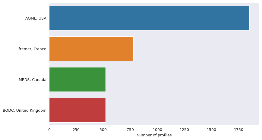
fig, ax = idx.plot('profiler')
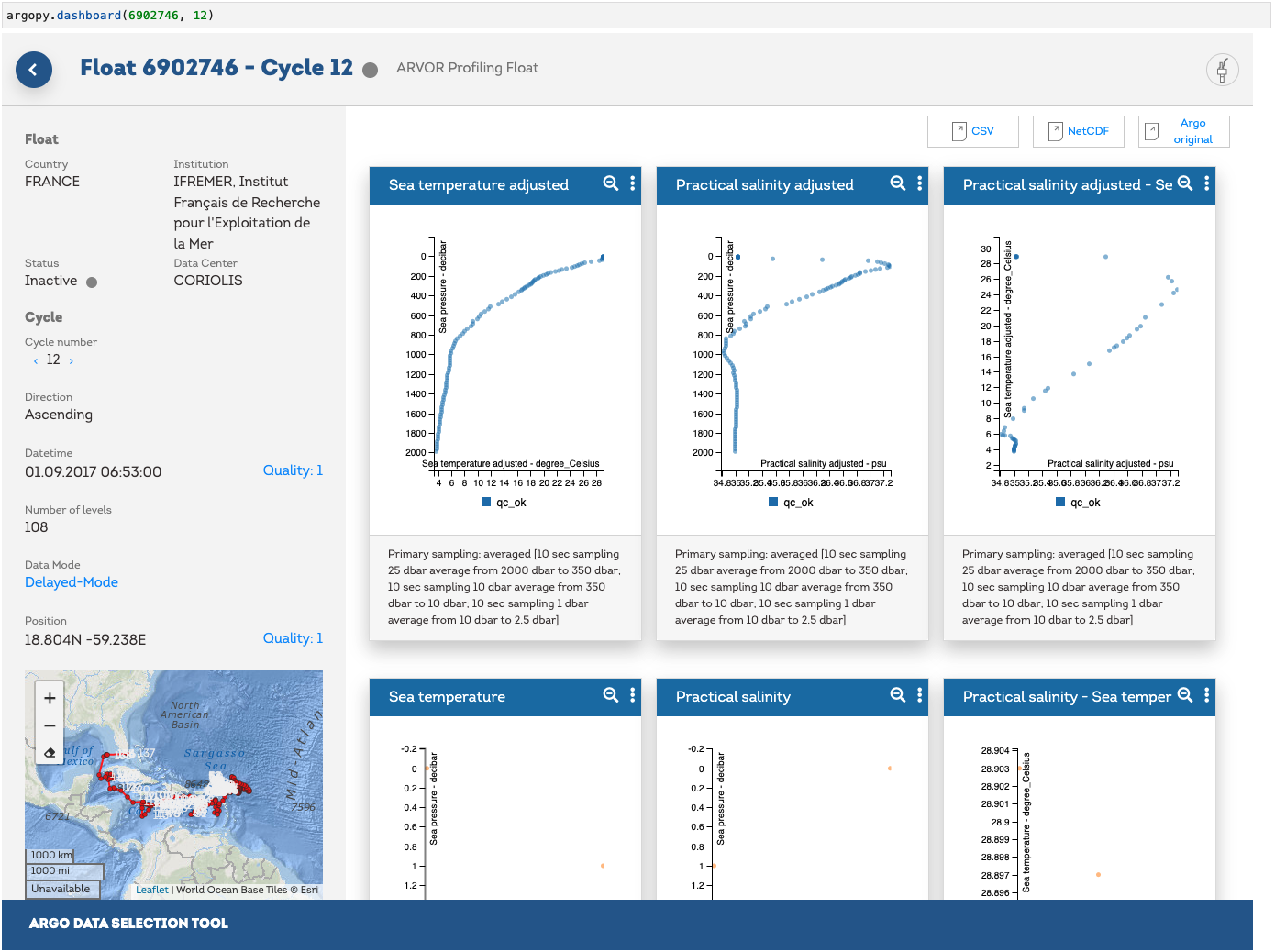
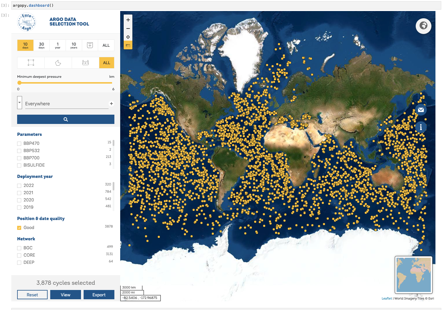
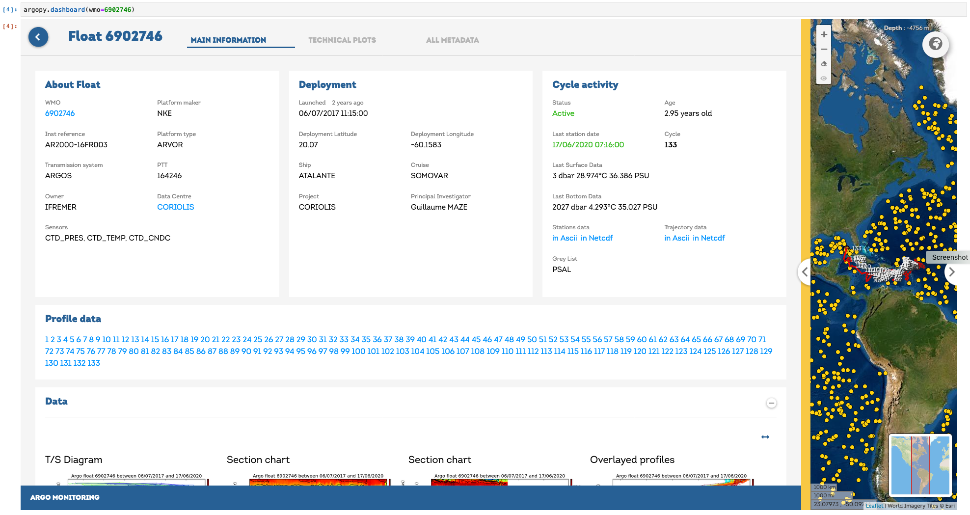
Dashboards#
We provide a few shortcuts toward third-party online dashboards that can help you visualise float or profile data.
When working in Jupyter notebook, you can insert a dashboard in a cell, or get the url toward the dashboard to open it elsewhere.
You have access to the Euro-Argo ERIC, Ocean-OPS, Argovis and BGC dashboards with the option type. See argopy.dashboard() for all the options.
Summary of available dashboards:
Type |
base |
float |
profile |
|---|---|---|---|
“data”, “ea” |
X |
X |
X |
“meta” |
X |
X |
X |
“bgc” |
X |
X |
X |
“ocean-ops”, “op” |
X |
X |
|
“coriolis”, “cor” |
X |
||
“argovis” |
X |
X |
X |
Note
Dashboards can be open at the package level or from data fetchers.
Open the default dashboard:
import argopy
argopy.dashboard()
for a specific float, just provide its WMO:
import argopy
argopy.dashboard(5904797)
# or
ArgoDataFetcher().float(5904797).dashboard()
or for specific float cycle:
import argopy
argopy.dashboard(5904797, 12)
# or
ArgoDataFetcher().profile(5904797, 12).dashboard()