Data visualisation#
From a DataFetcher#
The DataFetcher come with a plot method to have a quick look to your data. This method can take trajectory, profiler, dac and qc_altimetry as arguments. All details are available in the DataFetcher.plot class documentation.
Below we demonstrate major plotting features.
Let’s import the usual suspects:
from argopy import DataFetcher
Trajectories#
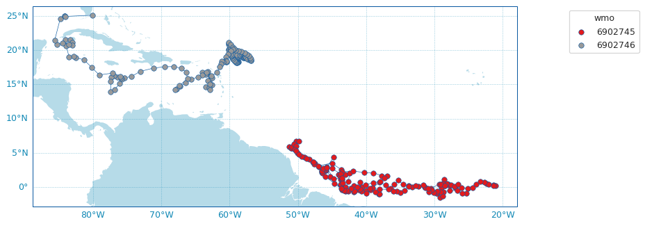
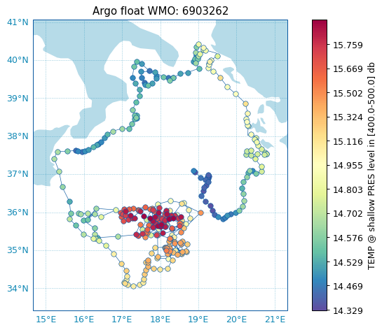
Adf = DataFetcher(src='gdac').float([6902745, 6902746])
Adf.plot('trajectory')
Adf.plot()  # Trajectory is the default plot
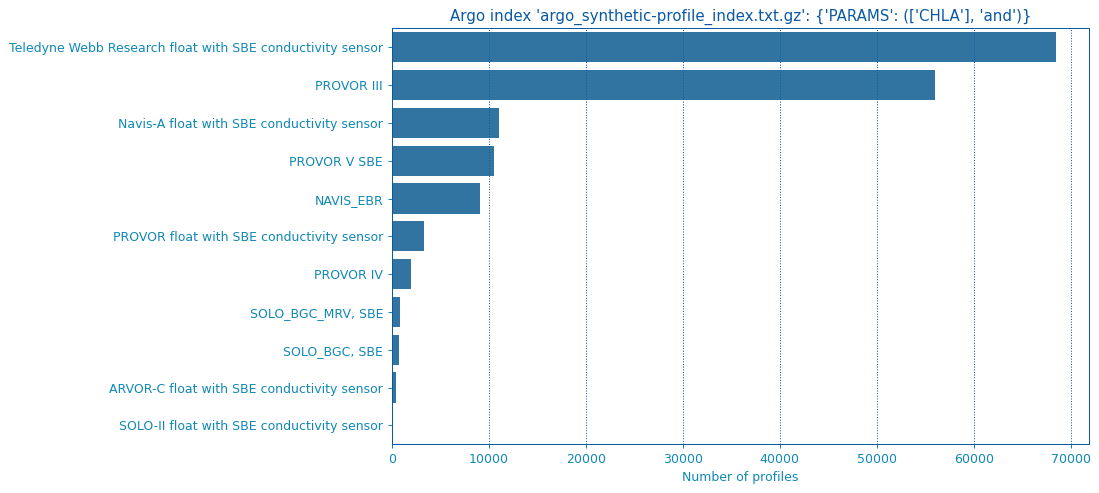
Histograms on properties#
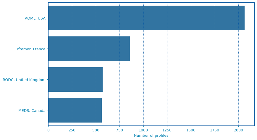
It is also possible to create horizontal bar plots for histograms on some data properties: profiler and dac:
Adf = DataFetcher(src='gdac').region([-80,-30,20,50,0,100,'2021-01','2021-08'])
Adf.plot('dac')
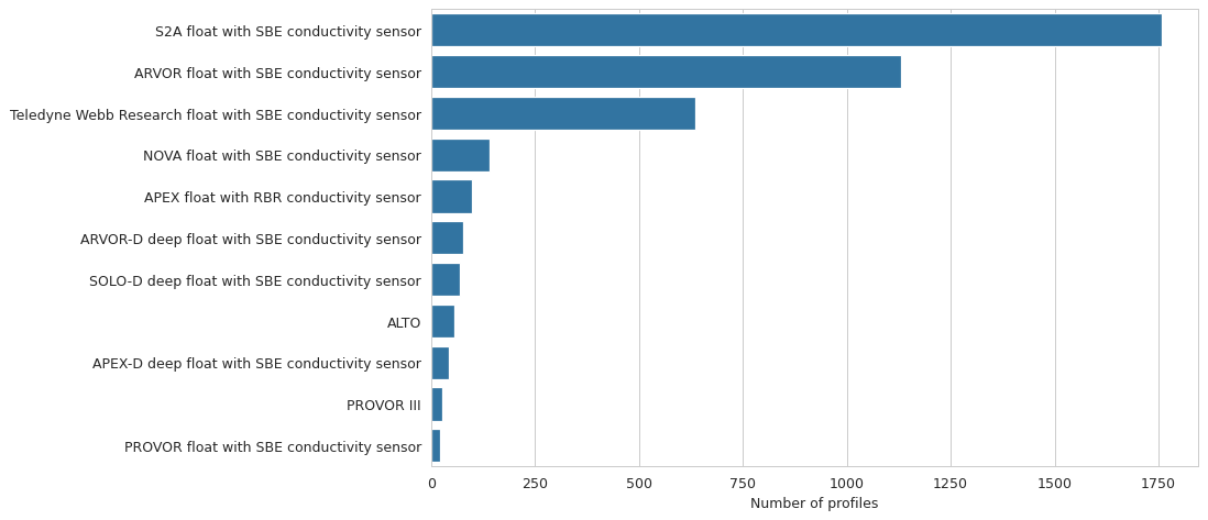
If you have Seaborn installed, you can change the plot style:
Adf.plot('profiler', style='whitegrid')
From an ArgoFloat#
The ArgoFloat class come with a ArgoFloat.plot accessor than can take several methods to quickly visualize data from the float.
Check the dedicated documentation section or the detailed arguments on the API reference ArgoFloat.plot.
From an ArgoIndex#
The ArgoIndex class come with a ArgoIndex.plot accessor than can take several methods to quickly visualize data from the float.
Check the dedicated documentation section or the detailed arguments on the API reference ArgoIndex.plot.
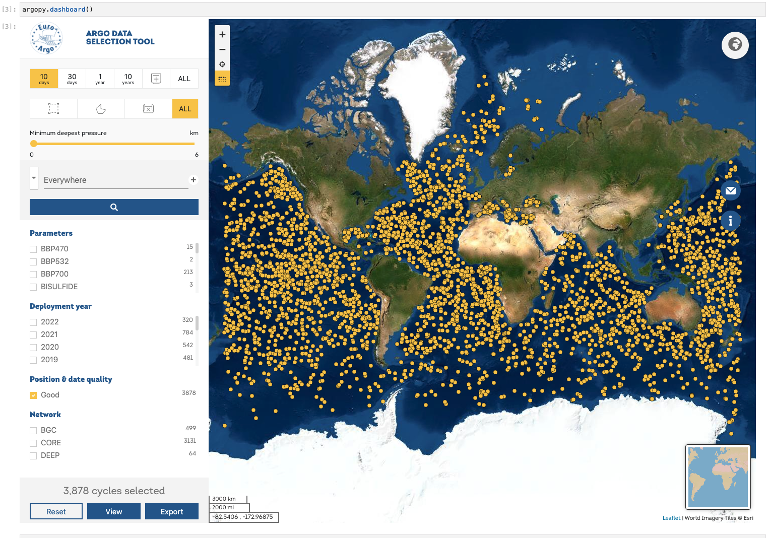
Dashboards#
We provide shortcuts to third-party online dashboards that can help you visualise float or profile data. When working in Jupyter notebooks, you can insert a dashboard in a cell, or if you don’t, you can get the url toward the dashboard to open it elsewhere.
We provide access to the Euro-Argo ERIC, Ocean-OPS, Argovis and BGC dashboards with the option type. See dashboard() for all the options.
Summary of all available dashboards:
Type name |
base |
float |
profile |
|---|---|---|---|
“data”, “ea” |
X |
X |
X |
“meta” |
X |
X |
X |
“bgc” |
X |
X |
X |
“ocean-ops”, “op” |
X |
X |
|
“coriolis”, “cor” |
X |
||
“argovis” |
X |
X |
X |
Examples:
Open the default dashboard like this:
argopy.dashboard()
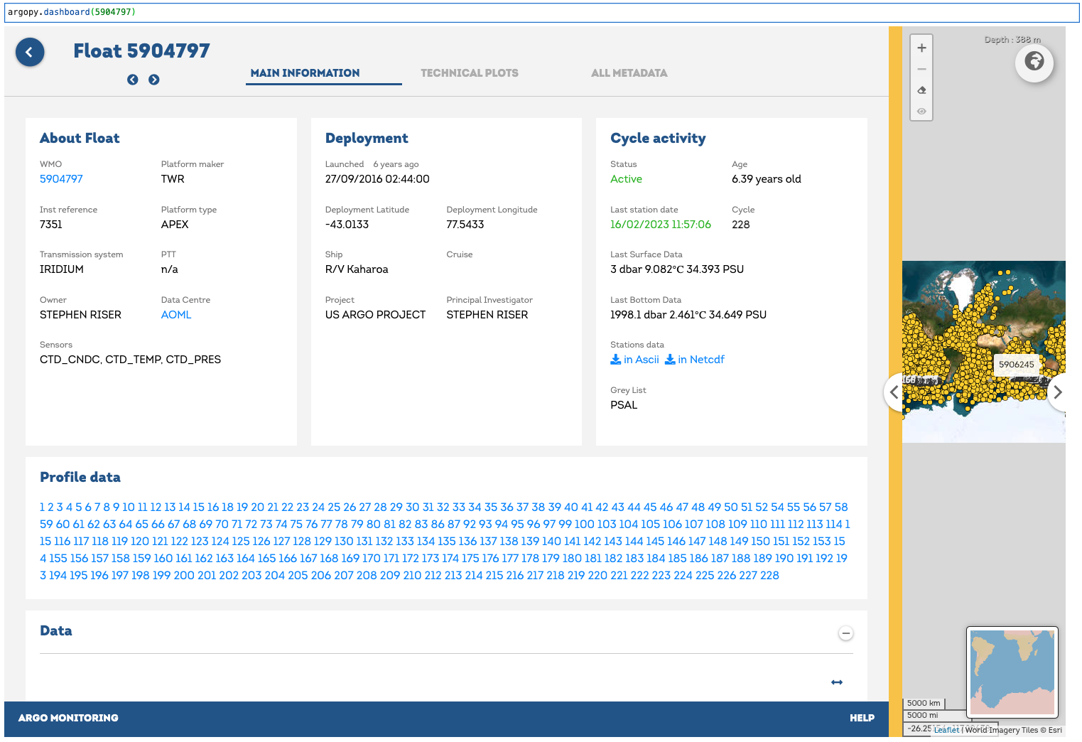
For a specific float, just provide its WMO:
argopy.dashboard(5904797)
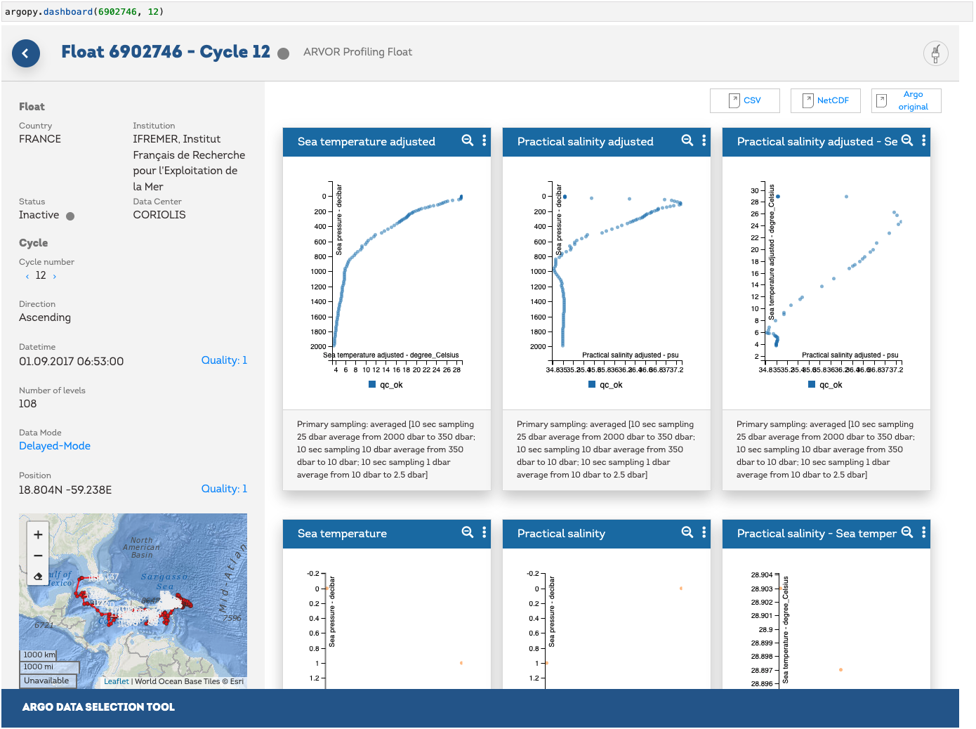
For a specific float profile, provide its WMO and cycle number:
argopy.dashboard(6902746, 12)
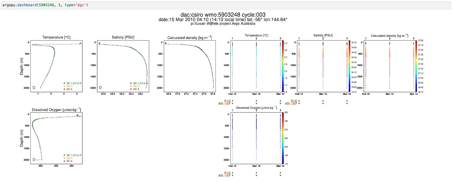
and for a BGC float, change the type option to bgc:
argopy.dashboard(5903248, 3, type='bgc')
Note
Dashboards can be open at the package level or from data fetchers. So that we have the following equivalence:
argopy.dashboard(WMO)
# similar to:
DataFetcher().float(WMO).dashboard()
and:
argopy.dashboard(WMO, CYC)
# similar to:
DataFetcher().profile(WMO, CYC).dashboard()
Utilities#
Scatter Maps#
The argopy.plot.scatter_map utility function is dedicated to making maps with Argo profile positions coloured according to specific variables: a scatter map.
Profiles colouring is finely tuned for some variables: QC flags, Data Mode and Deployment Status. By default, floats trajectories are always shown, but this can be changed with the traj boolean option.
Note that the argopy.plot.scatter_map integrates seamlessly with argopy Argo Index store pandas.DataFrame and xarray.Dataset collection of profiles. However, all default arguments can be overwritten so that it should work with other data models.
Let’s import the usual suspects and some data to work with.
from argopy.plot import scatter_map
from argopy import DataFetcher, OceanOPSDeployments

ArgoSet = DataFetcher(mode='expert').float([6902771, 4903348]).load()
ds = ArgoSet.data.argo.point2profile()
df = ArgoSet.index

df_deployment = OceanOPSDeployments([-90, -10, 0, 90]).to_dataframe()
And see in the examples below how it can be used and tuned.
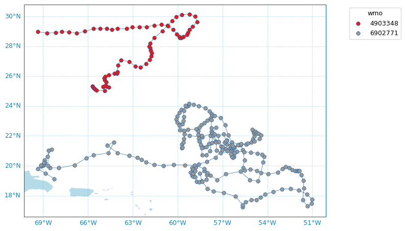
Default scatter map for trajectories#
By default, the argopy.plot.scatter_map() function will try to plot a trajectory map, i.e. a map where profile points are of the same color for each floats and joined by a simple line.
Note
If Cartopy is installed, the argopy.plot.plot_trajectory() called by DataFetcher.plot and IndexFetcher.plot with the trajectory option will rely on the scatter map described here.
scatter_map(df)
Arguments can be passed explicitly as well:
scatter_map(df,
            x='longitude',
            y='latitude',
            hue='wmo',
            cmap='Set1',
            traj_axis='wmo')
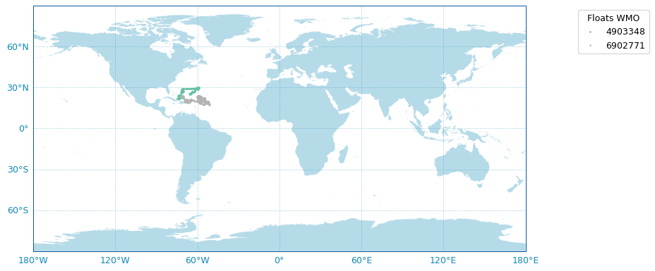
Some options are available to customise the plot, for instance:
fig, ax, _ = scatter_map(df,
                   figsize=(10,6),
                   set_global=True,
                   markersize=2,
                   markeredgecolor=None,
                   legend_title='Floats WMO',
                   cmap='Set2')
Use predefined Argo Colors#
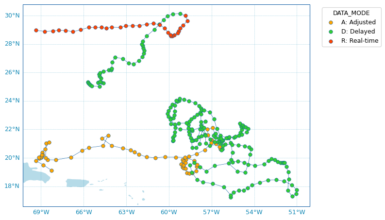
The argopy.plot.scatter_map function uses the ArgoColors utility class to better resolve discrete colormaps of known variables. The colormap is automatically guessed using the hue argument. Here are some examples.
Using guess mode for arguments:
scatter_map(ds, hue='DATA_MODE')
or more explicitly, this is equivalent to:
scatter_map(ds,
            x='LONGITUDE',
            y='LATITUDE',
            hue='DATA_MODE',
            cmap='data_mode',
            traj_axis='PLATFORM_NUMBER')
Since QC flags are given for each measurements, we need to select a specific depth levels for this plot. By default, we select data from the first vertical level along the N_LEVELS dimension.
scatter_map(ds, hue='PSAL_QC')
using guess mode for arguments, or more explicitly, this is equivalent to:
scatter_map(ds.isel(N_LEVELS=0),
            x='LONGITUDE',
            y='LATITUDE',
            hue='PSAL_QC',
            cmap='qc',
            traj_axis='PLATFORM_NUMBER')
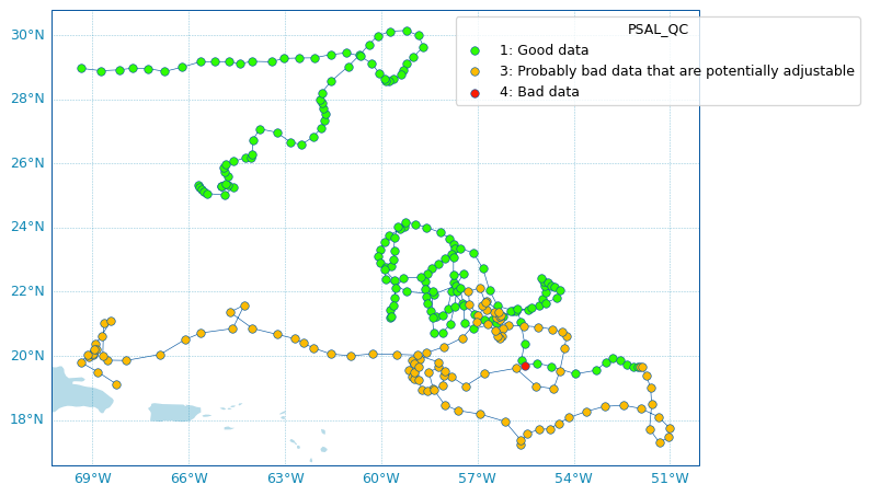
Hint
Since the PSAL_QC variable has more than vertical level, we need to select which one to use for the plot.
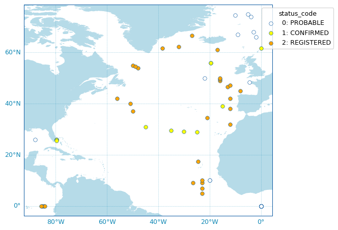
For the deployment status, there is only one point for each float, so we can make a faster plot by not using the traj option.
scatter_map(df_deployment, hue='status_code', traj=False)
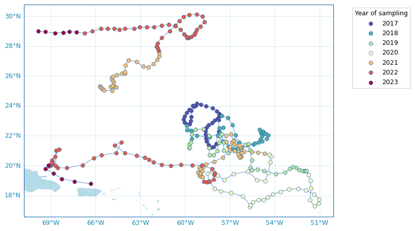
Use any colormap#
Beyond the predefined set of Argo colors, one can use any colormap that can be discretesized.
In the example below, we plot profile years of sampling using the reverse Spectral colormap:
ds['year'] = ds['TIME.year']  # Add new variable to the dataset
scatter_map(ds,
            hue='year',
            cmap='Spectral_r',
            legend_title='Year of sampling')
Argo colors#
For your own plot methods, argopy provides the ArgoColors utility class to better resolve discrete colormaps of known Argo variables.
The class ArgoColors is used to get a discrete colormap (available with the cmap attribute), as a matplotlib.colors.LinearSegmentedColormap.
The Use predefined Argo Colors section above gives examples of the available colormaps that are also summarized here:
ArgoColors('data_mode')
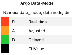
In [1]: ArgoColors('data_mode').definition
Out[1]:
{'name': 'Argo Data-Mode',
 'aka': ['datamode', 'dm'],
 'constructor': <bound method ArgoColors._colormap_datamode of <argopy.plot.argo_colors.ArgoColors object at 0x74bc06c4cd90>>,
 'ticks': ['R', 'A', 'D', ' '],
 'ticklabels': ['Real-time', 'Adjusted', 'Delayed', 'FillValue']}
ArgoColors('qc_flag')
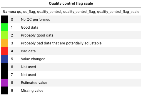
In [2]: ArgoColors('qc_flag').definition
Out[2]:
{'name': 'Quality control flag scale for measurements',
 'aka': ['qc_flag',
  'quality_control',
  'quality_control_flag',
  'quality_control_flag_scale'],
 'constructor': <bound method ArgoColors._colormap_quality_control_flag of <argopy.plot.argo_colors.ArgoColors object at 0x74bc06c4e010>>,
 'ticks': array([0, 1, 2, 3, 4, 5, 6, 7, 8, 9]),
 'ticklabels': ['No QC performed',
  'Good data',
  'Probably good data',
  'Probably bad data that are potentially adjustable',
  'Bad data',
  'Value changed',
  'Not used',
  'Not used',
  'Estimated value',
  'Missing value']}
ArgoColors('pqc_flag')
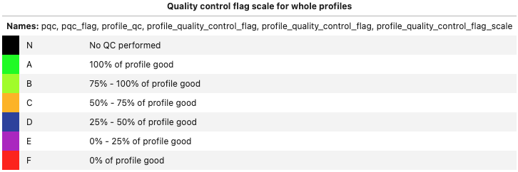
In [3]: ArgoColors('pqc_flag').definition
Out[3]:
{'name': 'Quality control flag scale for whole profiles',
 'aka': ['pqc_flag',
  'profile_qc',
  'profile_quality_control_flag',
  'profile_quality_control_flag',
  'profile_quality_control_flag_scale'],
 'constructor': <bound method ArgoColors._colormap_profile_quality_control_flag of <argopy.plot.argo_colors.ArgoColors object at 0x74bc1c3c2710>>,
 'ticks': ['N', 'A', 'B', 'C', 'D', 'E', 'F'],
 'ticklabels': ['No QC performed',
  '100% of profile good',
  '75% - 100% of profile good',
  '50% - 75% of profile good',
  '25% - 50% of profile good',
  '0% - 25% of profile good',
  '0% of profile good']}
ArgoColors('deployment_status')
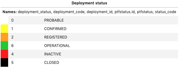
In [4]: ArgoColors('deployment_status').definition
Out[4]:
{'name': 'Deployment status',
 'aka': ['deployment_code',
  'deployment_id',
  'ptfstatus.id',
  'ptfstatus',
  'status_code'],
 'constructor': <bound method ArgoColors._colormap_deployment_status of <argopy.plot.argo_colors.ArgoColors object at 0x74bc1cb3ca10>>,
 'ticks': [0, 1, 2, 6, 4, 5],
 'ticklabels': ['PROBABLE',
  'CONFIRMED',
  'REGISTERED',
  'OPERATIONAL',
  'INACTIVE',
  'CLOSED']}
ArgoColors('months')
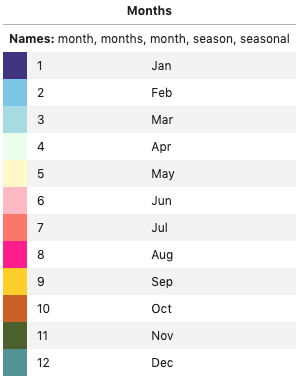
In [5]: ArgoColors('months').definition
Out[5]:
{'name': 'Months',
 'aka': ['months', 'month', 'season', 'seasonal'],
 'constructor': <bound method ArgoColors._colormap_month of <argopy.plot.argo_colors.ArgoColors object at 0x74bc1c36d150>>,
 'ticks': array([ 1,  2,  3,  4,  5,  6,  7,  8,  9, 10, 11, 12]),
 'ticklabels': ['Jan',
  'Feb',
  'Mar',
  'Apr',
  'May',
  'Jun',
  'Jul',
  'Aug',
  'Sep',
  'Oct',
  'Nov',
  'Dec']}
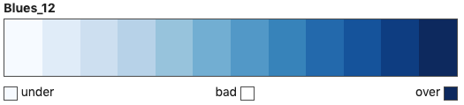
Note that ArgoColors can also be used to discretise any colormap:
ArgoColors('Blues')
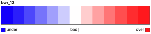
ArgoColors('bwr', N=13)